Finding a balance of both heart and head for Turas.
Turas is an addiction counselling service and charitable organisation based in Ireland. We were tasked with breathing new life into a tired brand, with no clear consistency in its message.
‘Turas’ means ‘journey’ in Gaelic. The rebrand aims to highlight the work carried out by Turas by talking about the solutions that they offer rather than just the problems they bear witness to. Instead of focusing on the addictions that Turas helps with, the rebrand gave the audience a chance to focus on the emotions.

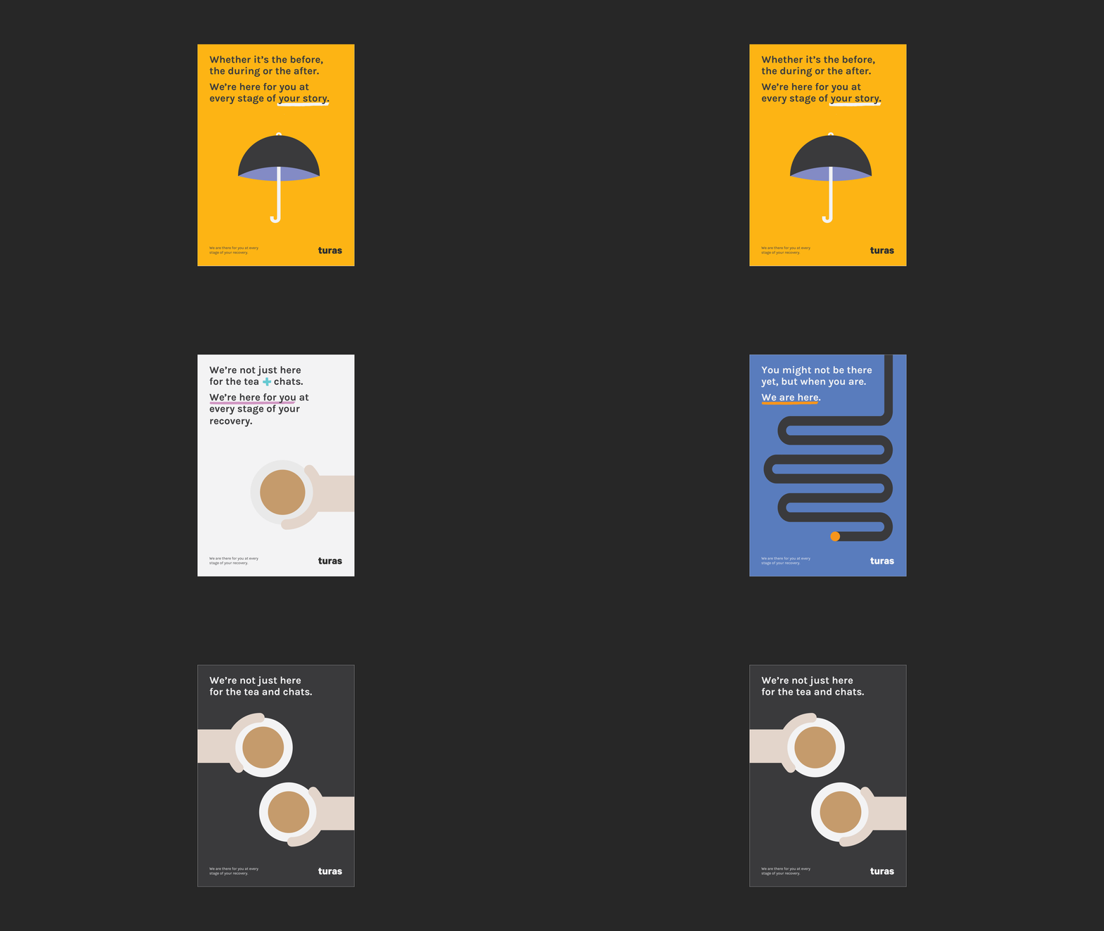
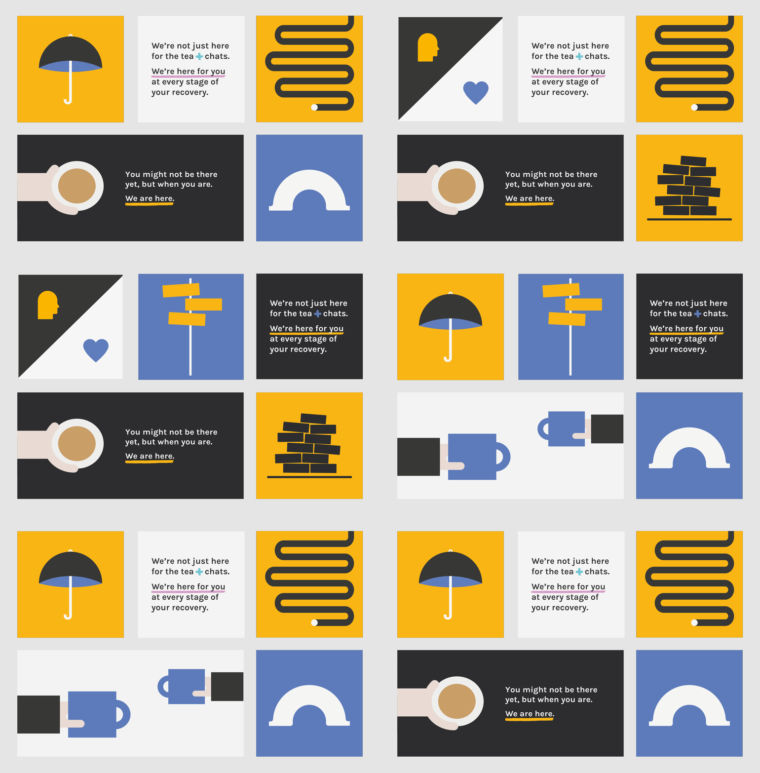
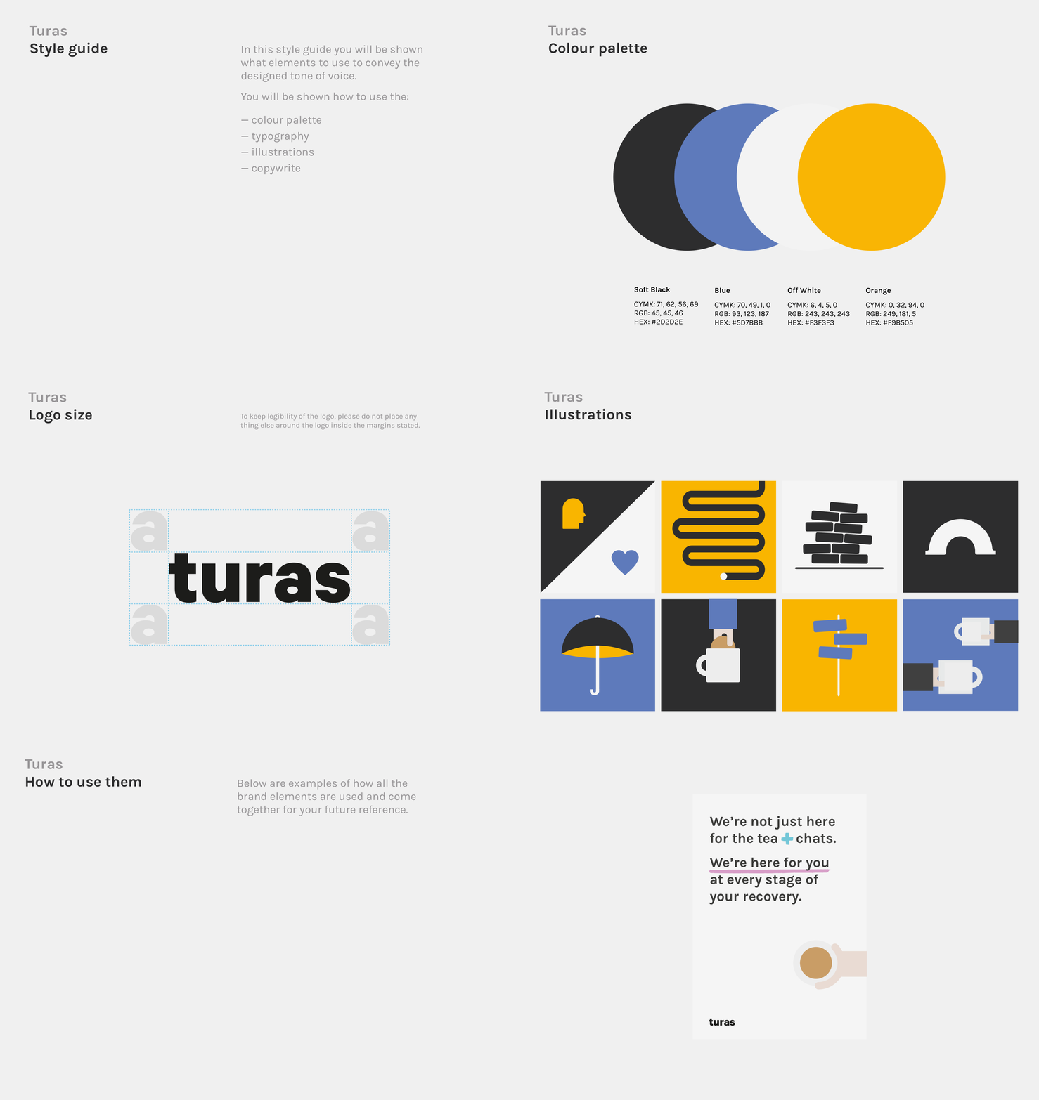
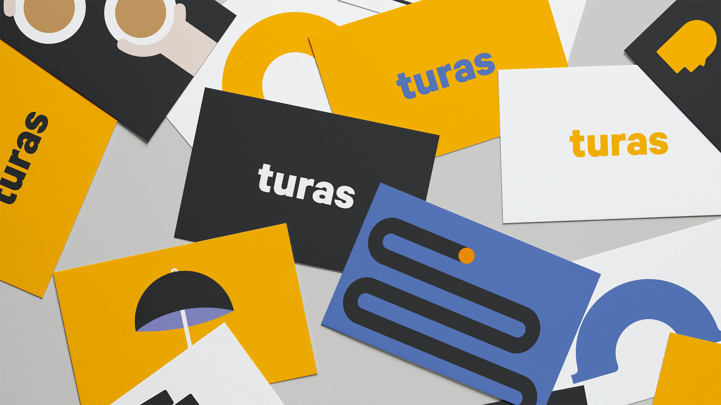
We did this by not only creating a brand that stands out from their competitors but showcases the way they work with people; with empathy and understanding. We simplified the language which they used, making a statement and informative pieces more emotive, engaging and contemporary. This new succinct language then influenced the creation of a suite a conceptual illustrations to sit harmoniously alongside when needed.


The context of illustrations focus on a journey and portraying a glimpse into normal everyday activities. The idea of journey is shown in the use of fluid icons and their movement between words, or in replacement of them. The use of the line and circle – emulating a journey.
