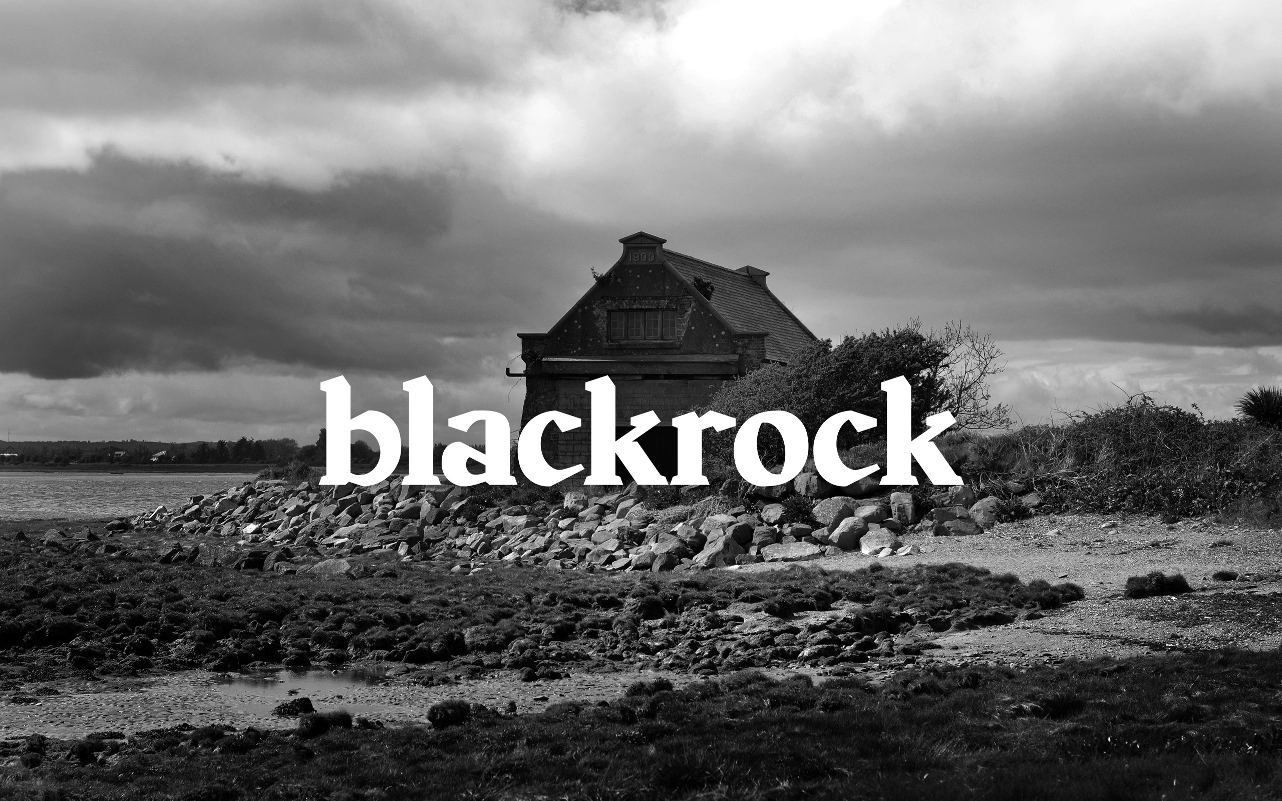
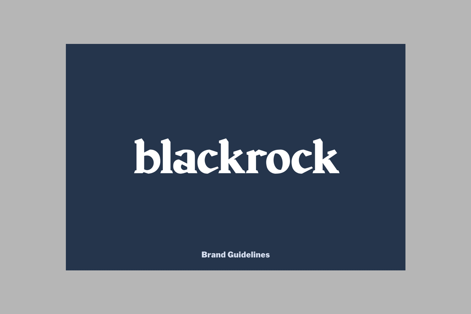
Altering the perception of Blackrock, by carving an authentic identity; inspired by it’s rugged landscape.
Custom wordmark and visual identity for Blackrock; a quaint, picturesque seaside village, located just outside Dundalk, Co. Louth.
This identity had to realistically reflect what the village has to offer for potential visitors; an escape to a beautiful part of Ireland; a sanctuary. A key design consideration was to preserve and protect the Blackrock way of life for future generations to experience and enjoy, reflecting its culture of hospitality and family lifestyle values.
The wordmark, with its sharp cuts and sturdy stems, is inspired by the jagged shapes of the sedimentary rocks which adorn the Blackrock coastline.

The Blackrock Tourism & Development Group requested that the brand be an honest reflection of Blackrock – quaint and understated, contemporary but inclusive, and for that reason, we focused our attention to the landscape; drawing inspiration from what has always been there, and what will continue to be there for generations to come.


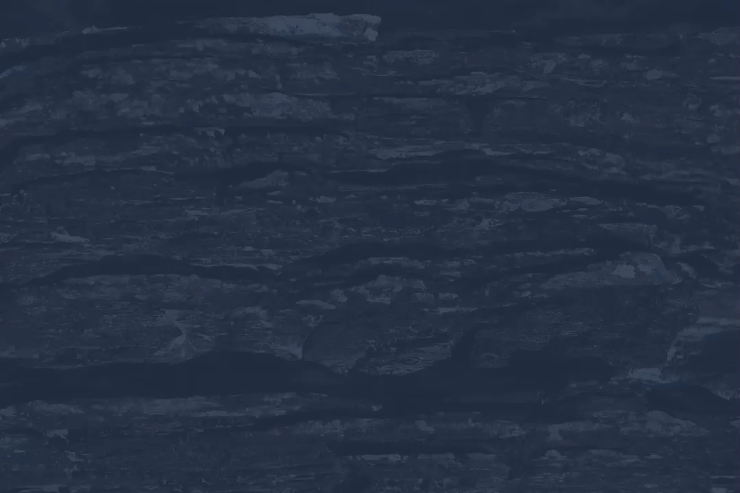


Ever since the early days of Blackrock, when it was known as Lurgangreen, the sedimentary rocks which adorn it’s coastal terrain have always been a key characteristic of the of the visual landscape. We used the chiseled cuts and angles of these sedimentary rocks as inspiration for the custom drawn logotype which the rest of the visual identity was built upon. As featured on Monocle Magazine – Monocle on Design
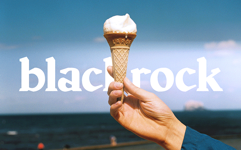


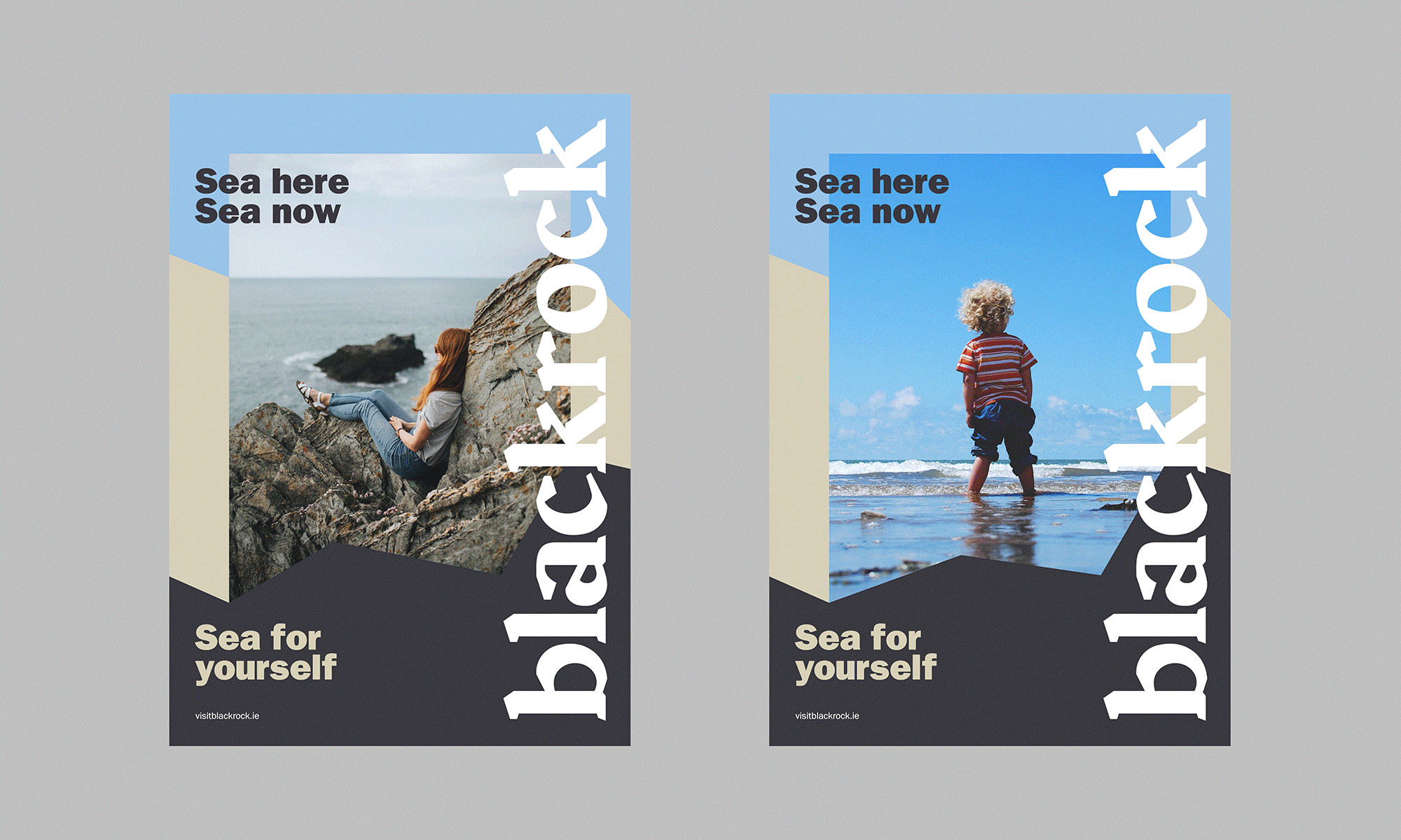
The view, the sea, the atmosphere – a sanctuary rather than an adventure. Humble and honest – a visual identity which intrigues, rather than deceives.


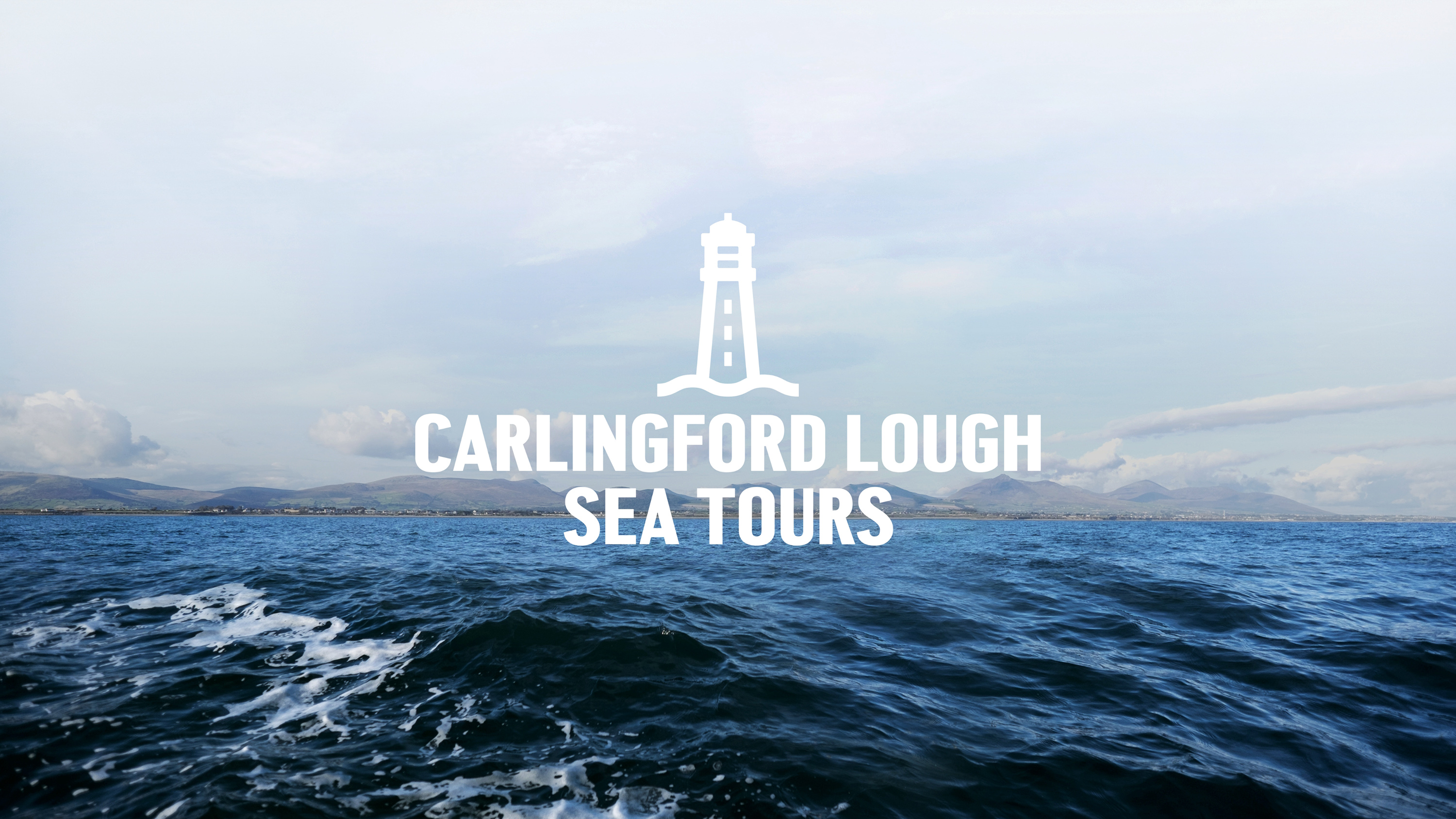
Capturing the spirit of the ocean for Carlingford Lough Sea Tours.
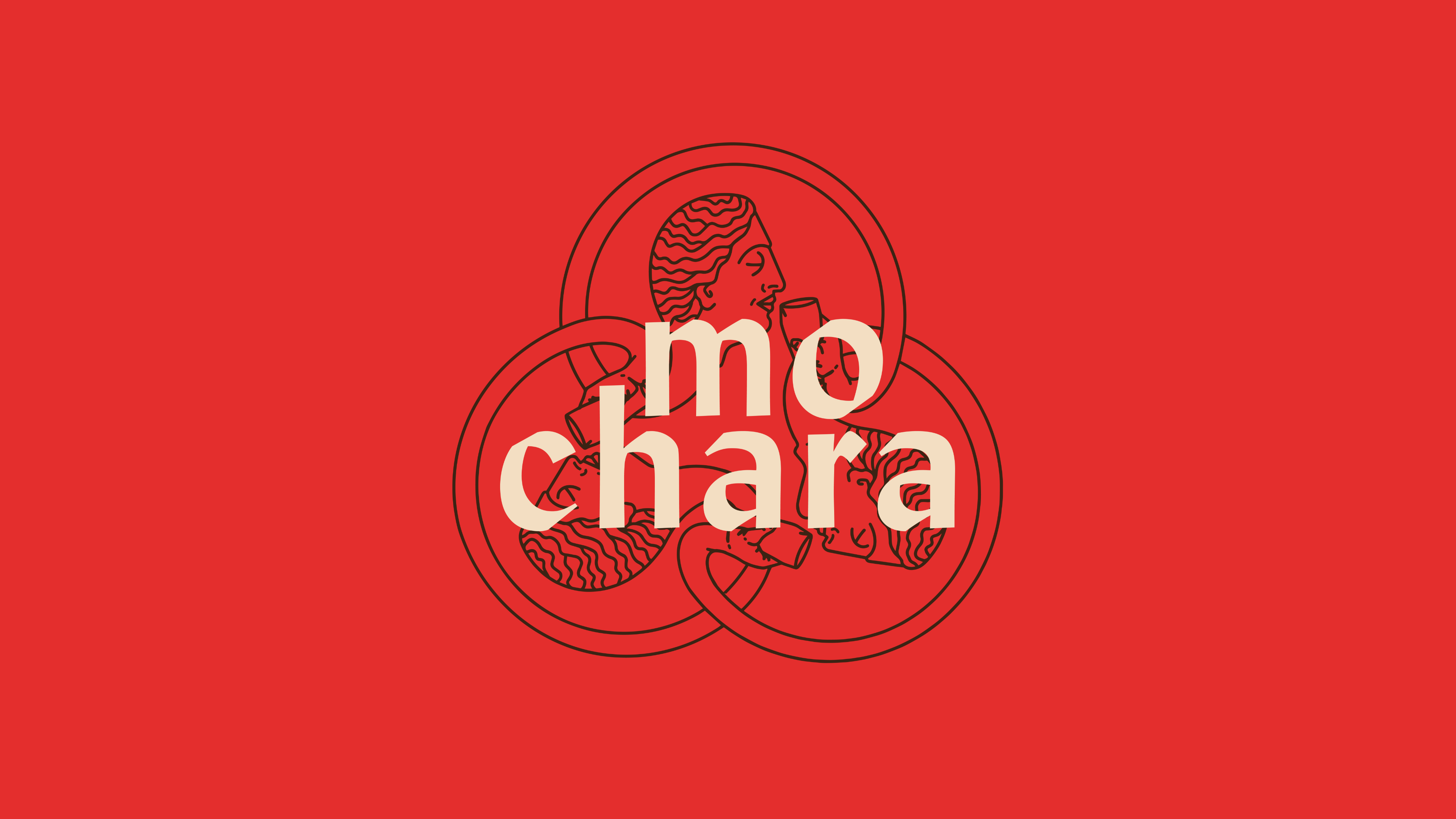
This round is on us. Mo Chara; branding Dundalk’s first taphouse.
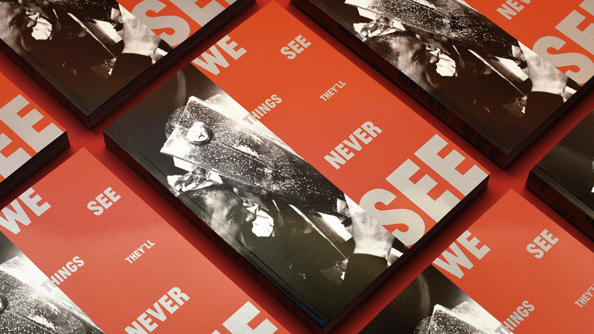
Another season, another league title, another book for Dundalk FC.